The Many Aspects of the Legion Book Covers
The conclusion to Brandon’s Legion series is almost here! In a few short weeks you’ll get to read the finale to Stephen Leeds’s story, complete with J.C.’s lovable antics, Tobias’s calming Wikipedia-like knowledge, and Ivy’s psychological profiling.
The end (of a series) is coming! And I’m feeling nostalgic. Let’s take a walk down memory lane and discuss the various covers the books have had over the years. There have been almost as many covers as Stephen has aspects!
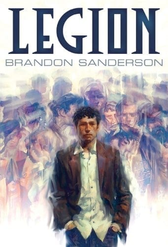
Back in 2012, Legion was about to be released for the first time through Subterranean Press, and Jon Foster painted a fantastic illustration for it.

About the same time, Peter and Brandon contacted me about doing a cover for the ebook. Since the rights to the amazing Jon Foster cover were connected to Subterranean Press’s edition of the book, we had the opportunity to do our own thing for the Dragonsteel ebook edition. Luckily, Brandon already had a clear idea of what he was looking for, and pointed me to the stylized black, white, and red movie poster for Ocean’s 11.
I got to work thumbnailing some ideas. The first rough image I sent to him was this beauty, made from stock photos I’d found.

Yeah, it wasn’t working. So later that same day, I was wracking my brain for other ideas.
At the time, I was working as an animator in video games. I used a piece of plexiglass over my screen that I would draw on with dry-erase markers to help me keep track of poses and the timing of the characters I was animating. Occasionally, I would doodle on it too, especially when inspiration struck and I couldn’t get to pencil and paper fast enough. But honestly, this concept probably came from one that Peter had worked up as a potential idea

From thence came this image:

Brandon liked it. I got the thumbs up and went to work fleshing it out into a real cover. Taking cues from the Ocean’s 11 poster, I scheduled a photoshoot for after work at the video game company and gathered together a bunch of my coworkers (and my wife Kara) and took pictures of them. A bit of Photoshop magic later, and we had this:

(Apologies to Kara and my old co-workers for posting this. FYI, I’m the one on the right, in the hoodie.)
I knew this wasn’t quite working, but I sent it anyway. Brandon confirmed. The style was right, but this looked more like a bunch of people rising up to take back control of the government than a story about a man with multiple aspects. But I had a backup plan. Stock photos.
I sought out images that represented several of the different characters. And it worked!

Though I did try a version with anime-haired Stephen Leeds at one point.
On a related note, I’ve always pictured Stephen as being played by the lead singer of Maroon 5, Adam Levine. (At least until I saw Miranda Meeks’s take on Stephen. More on that later.)
Thinking about each of the characters is what really filled this out. Though you can still see some of the silhouettes of my former coworkers in the crowd of people behind Stephen, the characters at the forefront are still very recognizable. There’s our Adam Levine-like Stephen out front flanked by J.C. and some other dude in a scarf, behind them there’s Kalyani, Ivy, and Tobias. Anyway, I think it worked. Though Amazon’s image compression at the time didn’t particularly like the color of red I chose, so we wound up having to change the title color to blue on that version.

A few years later I started working for Brandon full time, and Legion: Skin Deep had been released with another fantastic Jon Foster cover.

The crew at Dragonsteel began talking about what to put on the ebook cover for Skin Deep. Brandon wanted us to explore the mystery/thriller angle of things and for us to rebrand the series look and feel. So I revisited the first Legion and tried to come up with a new look. I went to the bookstore and took dozens of pictures of covers for thriller novels. What were publishers doing with Michael Crichton’s book covers these days? Patricia Cornwell, Lee Child, Sandra Brown, Dean Koontz, Catherine Coulter. I have dozens of pictures of these books. Then I analyzed them, pored over hundreds of images of stock photography, and tried to come up with something in the same vein.
I actually proposed these for the covers:

This time around I focused on the characters again—using the same stock photos as before—but this time, Stephen casts three shadows that look like the aspects.
You’ll notice that one of the comps still has the watermark from the stock photo place. That’s because we didn’t wind up going in that direction. In fact, we took my concept for Legion 1 and gave it to Legion 2. We didn’t go back and rebrand the first ebook at that time. So we wound up with this version for Skin Deep.

That worked for about a year. Around 2015, the physical copies of the books were getting harder to find, so we decided to print our own Dragonsteel hardcover editions of the books to keep them available. Brandon wanted me to try again to rebrand the books in the mystery/thriller genre. So back I went to looking for reference, this time paying close attention to mystery or thriller debuts that were doing well. I looked at a bunch of debut covers, including those from the Cormoran Strike books, written by J.K. Rowling under the Robert Galbraith pseudonym. Maybe you’ll see the influence those covers had on what I proposed:

We settled on a direction and wound up with these, which we also eventually carried over into the ebooks:

(Which are incidentally on sale in the store here and here.)
We printed the dust jackets on this gorgeous pearlescent stock. In person, I find them still quite striking. At the time, I had it in my head that maybe we would use the image from concept #3 above—with the snowy-looking village/warehouse—were we to need a third cover.
But things changed again when Tor asked to print an omnibus of the Legion books when Brandon wrote Lies of the Beholder. Of course, Jon Foster worked his usual magic for the Subterranean Press version, presenting what I think is the best of his three already-magnificent illustrations for the series.

We also got the usual awesomeness from the UK editions of the books, presented here all together for your enjoyment.

For the Tor omnibus cover, we pulled back from the thriller angle and asked instead for a more illustrated cover. They hired the amazing Miranda Meeks, and we couldn’t be happier. A bit of a note on this one. We tried a couple of times on previous iterations of the early covers to move in the shattered glass direction. I just could not pull it off. Where I failed, Miranda took the challenge head-on and succeeded. I love this cover illustration. In my head, Adam Levine has been recast by this new depiction of Stephen Leeds.

What’s more, Tor opted to print the cover on a type of foil, which makes it all the more silvery and shiny. You’re going to have to check this book out in person when it comes out. Not only is the cover gorgeous, the conclusion to the series is extremely satisfying. And soon you won’t have to track down different volumes to enjoy the whole story. I hope you’ll take a look at the book when it comes to bookstores on September 18th. I know where I’ll be.


