Mistborn Paperbacks 2019
Brandon’s art director Isaac here. The Mistborn series book covers have had a colorful history of different illustrations: the beautiful originals by Jon Foster, Chris McGrath’s iconic renditions that we can probably thank for some of the paperbacks’ success over the years, and of course let’s not forget Sam Weber’s fantastic covers for the young adult editions. Then there was that one cover with the grim reaper. Yeah, we don’t talk much about that one.
 Book design, just like fashion and automotive design, goes through phases. Thankfully we’re not quite getting a different “book look” with each season of the year, but the way a book cover is illustrated and designed can definitely tell you about how long it’s been on the market.
Sometime last year, we got into a discussion with Brandon’s agent Joshua about the Mistborn mass market covers. They’ve been on the paperback books for over a decade now, and it was time for a refresh. This is a testament to the Mistborn series’ longevity that it’s stayed in print long enough to even need new covers!
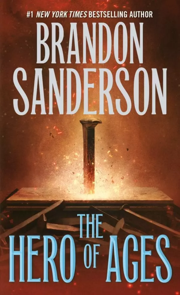
After a few brainstorming sessions, we were drawn to some of the symbolic book cover illustrations that Sam Weber has done recently. His work on Robert Jackson Bennett’s Divine Cities trilogy is beautiful.  (Please note, City of Stairs is one of my favorite fantasy books ever. It’s got more swears than Brandon’s books, so be aware of that, but oh man, can I get a leatherbound version of it someday, please?) Sam’s work for Kiersten White’s And I Darken series has resulted in some of my favorite book covers in any genre in any era. And have you seen his painting for Neil Gaiman’s Norse Mythology? Wow! And Sam’s cover for the YA version of Mistborn clearly showed that he really groks the series. So we asked Tor if Sam was available. We cheered when he was.

Here are the results. Symbolic paintings that hopefully convey the feeling of each of the books in the series. We hope these will reach across genres and capture readers’ attention. We hope they will stand out on the shelves and woo new readers at airports. Ultimately, we also hope the fans will like them. Hats off to Tor, and to Sam Weber, for putting these together. You have done the Cosmere a great service.


One more thing to note, Tor has redesigned the interiors of the mass market reissues, basing the text on the preferred versions found in our Dragonsteel leather editions. The result is a clean, very readable text, with fixes for the few typos and continuity glitches we’ve discovered over the years.
Please enjoy!

